Simplifying discovery and driving £3M+ in revenue
Role:
UX Design Manager
Team:
Product & Design
Skills:
User Research, Planning, Content Design & Testing


Situation
Through user research, I discovered that users struggled to understand what giffgaff offered or to find what they were looking for.

Task
I needed to align stakeholders, simplify the navigation design and content, reduce experience and tech debt, and deliver a unified UX.
Action
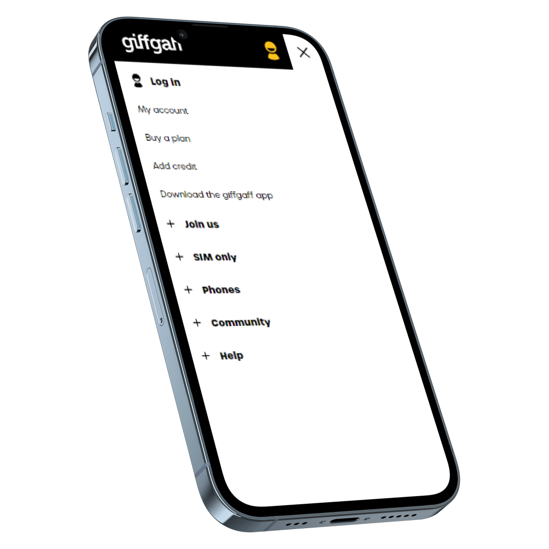
Identified 27+ variations of navigation across mobile and desktop.
Found UX and content inconsistencies, such as different terms being used, and inconsistent UI patterns.
I mapped out key stakeholders and their priorities

Insights
Found that new customers primarily used the navigation via the homepage, which had the highest engagement. I conducted user testing, asking participants to complete basic tasks like finding SIM-only plans.
Results
User testing highlighted frustrations around unclear labels, too many choices, and difficulty completing basic tasks like ordering a SIM or buying a phone.
From the insights, I developed a simple hypothesis: "By improving navigation and splitting SIMs and Phones, we will see an increase in sales."
I partnered with the BI and Optimisation teams to run an A/B test on the homepage navigation. The test provided the data needed to gain buy-in from the commerce and finance teams.

Conducted a market analysis of navigation best practices to inform the redesign.
Organised a card sorting exercise with users to understand how they categorised labels.
Introduced clear categories like "SIM-only plans" and "Phones" to replace confusing labels.


Results
Handset sales rose by 500 units per month, generating an estimated £2.9 million in revenue annually.
SIM activations increased by over 600 per month, adding an extra £100k per year in revenue.