Using my design thinking skills to keep exploring and learning
The evolution of
content roles
Content has come a long way, from crafting catchy ad slogans to shaping digital experiences.

We started as copywriters, mastering the art of persuasion in print and broadcast ads.
Content strategists emerged to bring order to the growing digital landscape.
The rise of UX and mobile-first design led to UX writers, making interactions seamless.
Today, content designers are central to shaping user journeys and product experiences.
Content design
meet-ups
I partnered with another content designer to host in-person meet-ups in London.
We wanted to create regular meet-ups for content designers to network and support each other.
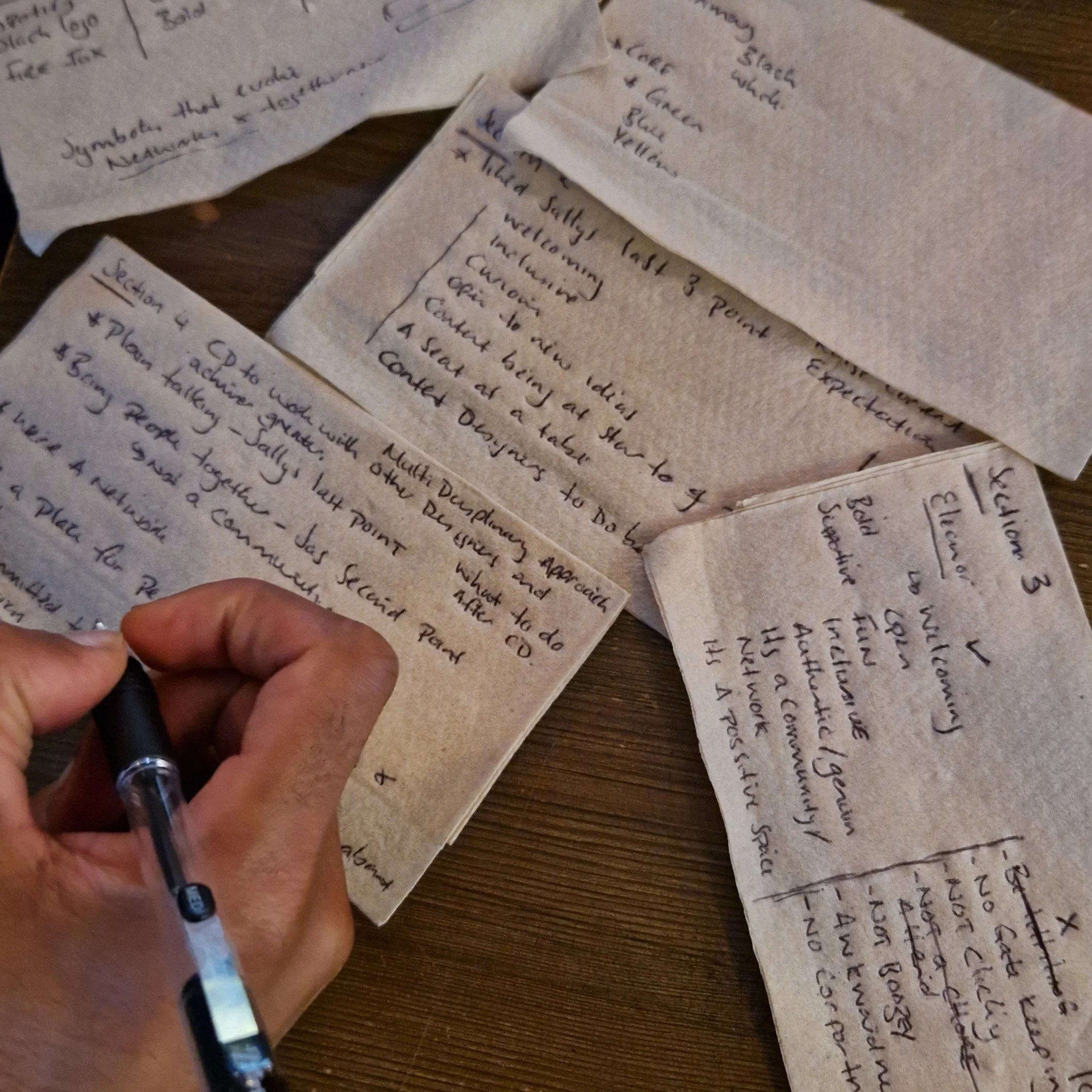
We’ve started brainstorming our brand identity, asking key questions like, what makes our brand unique? What traits best describe our brand, and which ones should we avoid? And how would our brand speak if it had a voice, and what would it say?
Wireframing a
coaching site
After drafting the initial content for a coaching website (Bounce Back), I created a high-level sketch of the user experience and content structure.
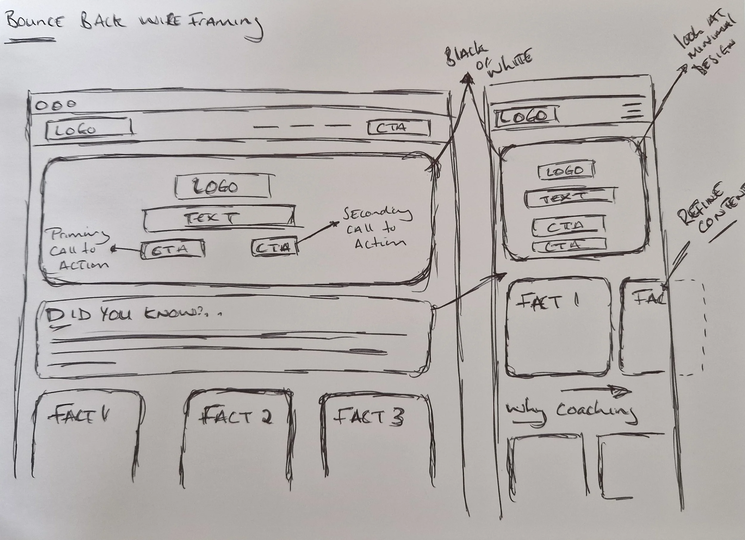
While the site is still in the early stages of development, these basic wireframes offer a solid foundation on which to build. They allow us to iterate and refine, bringing the coaching brand to life step by step.
Exploring bionic reading
In my latest blog post, "Embracing Circular Design for Sustainability," I explored an innovative approach to enhancing reader engagement and comprehension using Bionic Reading. This technique focuses on guiding visual attention by bolding key parts of words.
Dark Mode: Evaluated Bionic Reading's effectiveness in dark mode, a feature widely used to reduce eye strain.
Accessibility: Assessed its compatibility with screen readers to ensure it benefits visually impaired users without compromising accessibility.

Developing a visual identity
I took on the creative challenge of designing a logo for 'Bounce Back', a coaching brand focused on resilience and personal growth. The goal was to create a memorable and effective visual identity that resonates with the brand's mission.

Simplicity
Collaborated closely with the client to prioritise simplicity.
Colour
Selected orange to reflect the brand's qualities—warmth, friendliness and fun.
Feedback
Engaged with potential users through various design iterations.
Outcome
The iterative process led to a well-received final logo.
Site architecture redesign
Focus on intuitive navigation
Recognised the need for a more intuitive site structure. Initiated a card sorting exercise using KardSort to engage community members in categorising and renaming existing labels.

User-centred approach
The card sorting data will guide the development of a revamped site architecture. The goal is to create a clearer, more logical navigation pathway that aligns with users' natural browsing behaviours.