Design thnking
Using my design thinking skills to keep exploring and learning
Content design meet-ups
I partnered with two other content designers to host in-person meet-ups in London. We noticed a gap in the market; there were no regular meet-ups for content designers to network and support each other.
We aimed to unite like-minded people from the content design and user experience fields.
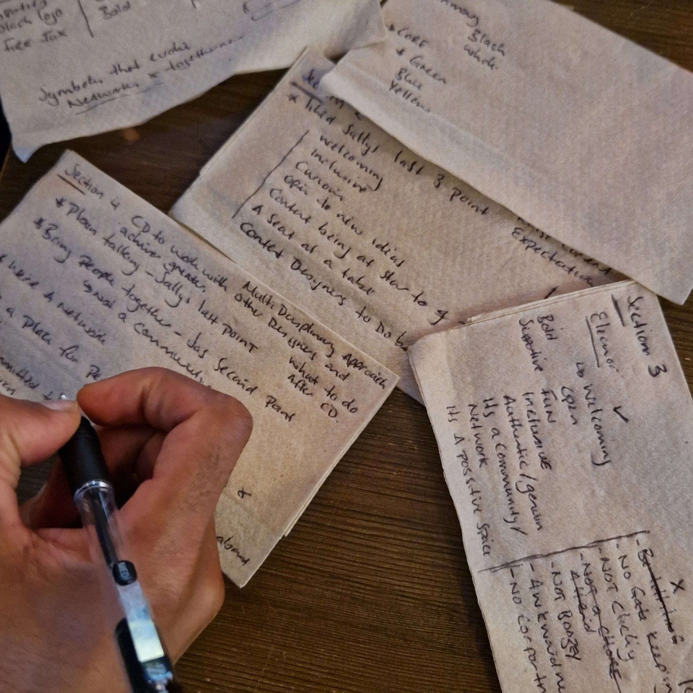
Starting these meet-ups was a challenge, but it has been a rewarding experience. As they grew in popularity, we began exploring ways to make them feel more structured and professional. We’ve started brainstorming our brand identity, asking key questions like:
What makes our brand unique?
What traits best describe our brand, and which ones should we avoid?
How would our brand speak if it had a voice, and what would it say?
Aside from black and white, which four colours represent us as a community?
Which logos inspire us?
This branding process is still a work in progress, but it’s an exciting step towards evolving our community.
Wireframing a coaching site
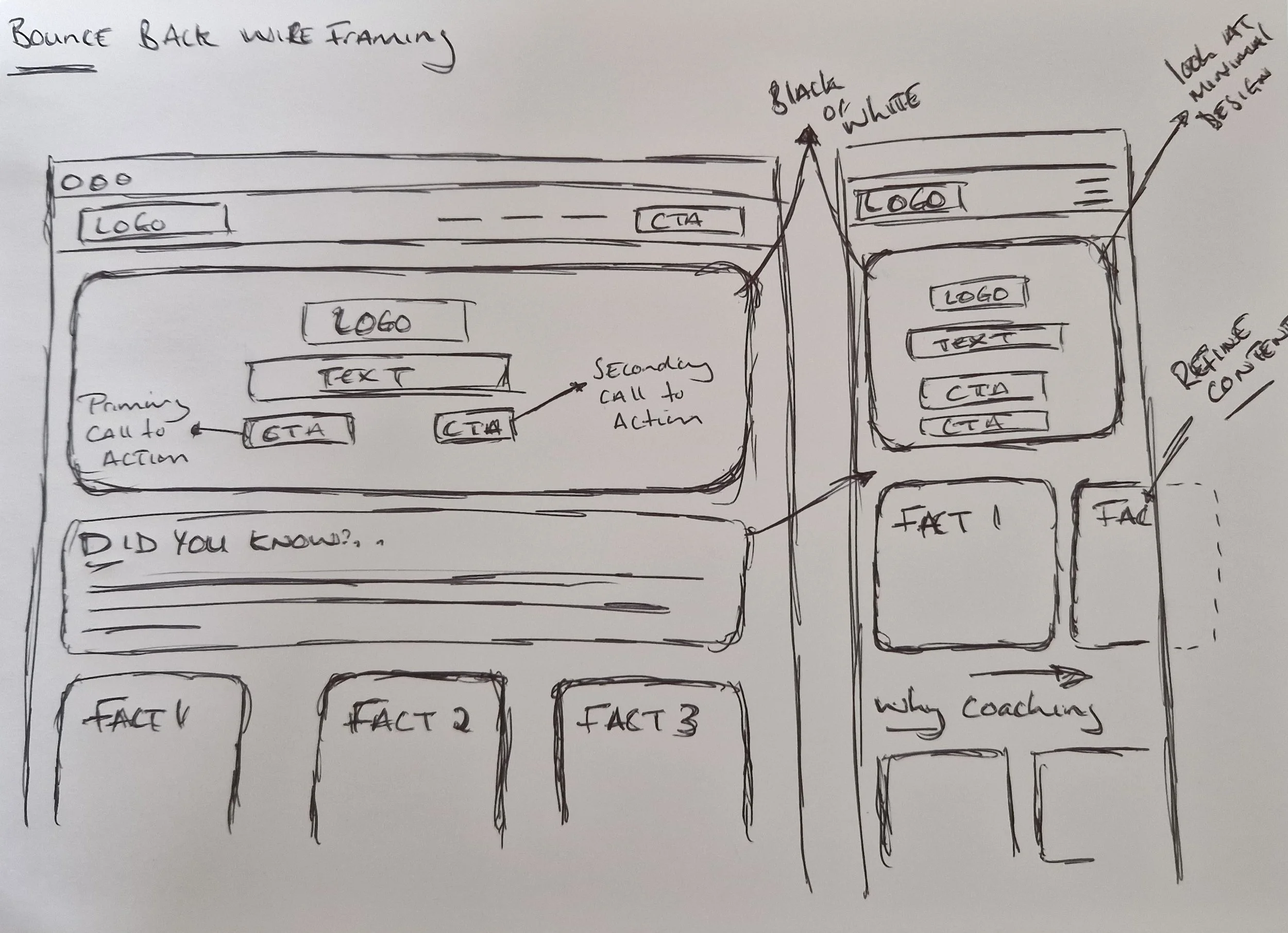
After drafting the initial content for a coaching website (Bounce Back), I created a high-level sketch of the user experience and content structure. While the site is still in the early stages of development, these basic wireframes offer a solid foundation on which to build. They allow us to iterate and refine, bringing the coaching brand to life step by step.
Exploring bionic reading
In my latest blog post, "Embracing Circular Design for Sustainability," I explored an innovative approach to enhancing reader engagement and comprehension using Bionic Reading. This technique focuses on guiding visual attention by bolding key parts of words.
Principle
Bionic Reading leverages the brain's ability to process information faster than the eyes can scan it. By bolding critical segments of text, it reduces visual effort and allows for quicker comprehension while preserving context.Focus areas
Dark Mode: Evaluated Bionic Reading's effectiveness in dark mode, a feature widely used to reduce eye strain.
Accessibility: Assessed its compatibility with screen readers to ensure it benefits visually impaired users without compromising accessibility.
Developing a visual identity
I took on the creative challenge of designing a logo for 'Bounce Back', a coaching brand focused on resilience and personal growth. The goal was to create a memorable and effective visual identity that resonates with the brand's mission.
Simplicity and readability
Collaborated closely with the client to prioritise simplicity.
Choose a distinctive, easy-to-read font to enhance brand visibility.
Colour strategy
Selected orange to reflect the brand's qualities—warmth, friendliness, energy, and fun.
Orange was chosen for its ability to encourage social interaction, aligning with the brand’s focus on personal development and community.
User feedback
Engaged with potential users through various design iterations.
Gathered feedback to refine the logo, ensuring it resonated with the audience.
Final outcome
The iterative process led to a well-received final logo that effectively captures the spirit of 'Bounce Back' and ensures a strong visual impact.
Site architecture redesign
I am leading an initiative to improve the findability and usability of a local community website.
Focus on intuitive navigation
Recognised the need for a more intuitive site structure.
Initiated a card sorting exercise using KardSort to engage community members in categorising and renaming existing labels.
User-centred approach
The card sorting data will guide the development of a revamped site architecture.
The goal is to create a clearer, more logical navigation pathway that aligns with users' natural browsing behaviours.
My role
Facilitate the card sorting sessions.
Strategically synthesise outcomes to propose a new, user-centred site structure.


